Bart Wisniowski, founder and CEO of Advisor Websites in the Canadian city of Vancouver, estimates that his firm has created more than two thousand websites for advisory firms all over the U.S. and Canada. He has the best seat in the house to watch the rapidly evolving state-of-the-art in website design and feature sets in this age of social media, video blogs and smartphones. He and his staff are constantly talking with advisors about what they want and how they want to present themselves – learning and teaching and adding bells and whistles as the profession evolves.
"We're launching websites literally every day," Wisniowski says. "There are always new developments, and we're always running into cool stuff."
In a recent interview, Wisniowski not only talked about the latest developments and trends that he's seeing; he also identified some of the advisory profession's most interesting and creative websites – which can be seen, with commentary, at the end of this article.
Creating a firm's website, Wisniowski says, is like creating a financial plan: It starts with an assessment of goals and objectives. "Are you primarily reaching out to your existing clients?" he says. "Or are you creating an environment that will attract prospects and acquire new clients? Are you active in social media? Are you blogging? In most cases," Wisniowski adds, "there's a combination of these things, but one or two of them is the main focus."
Upgrades from antediluvian
Are you willing to accept an unfair advantage as you build your business?
Bob Veres's Inside Information service takes you right to the cutting edge of new ideas, business-building insights, investment paradigms and marketing strategies as they arise from leading thinkers around the profession.
The service has been described as an "unfair advantage" by subscribers who are now among the most successful advisors in the business.
Knowledge is power. Try a year of Inside Information, with a money-back guarantee: www.bobveres.com, and give yourself the unfair advantage that you deserve in your professional career.
Best,
Bob Veres
Inside Information
At the most basic level, Wisniowski recommends that advisors give their website a visual upgrade. The online experience is changing so rapidly that websites created five years ago tend to look antediluvian, stodgy and out-of-touch. "Too often, we see the banner that is the same banner on everybody else's website, with stock photography of a couple holding hands," Wisniowski says. "In the financial services world, there is a definite overuse of stock photography."
This becomes most visible if there is a disconnect between the image and the view out the office window. "If you do business in New Mexico, you should really have New Mexico landscapes and not ocean views on your website," says Wisniowski. "A lot of advisors are still hesitant about pulling the trigger on getting professional headshots and photography, but it makes a huge difference in how professional you appear to a would-be client who is checking you out."
Usability is another issue. Wisniowski says there are definite best practices when it comes to the way your navigation is laid out – although, as we'll see in the actual examples, there is also a lot of variation. He recommends having clear calls to action, big buttons to navigate by – and making the site easy to scan even without your reading glasses. "One of the biggest issues that we see with some of the older websites out there is a small gray font," says Wisniowski. "A lot of the target audience for advisors is older people, and if you are making them squint on your website, they aren't going to stick around. Use large easy-to-read fonts."
Wisniowski also thinks that most advisor websites are visually unfriendly simply because the site is trying to say too much all at once. "Having too much content on your home page makes it cluttered, unusable and really frustrating for somebody to navigate," he says. "A lot of time, you could cut the content in half, and then in half again, and it becomes much friendlier and more inviting." The pruned content doesn't go away; it is moved to back pages, behind the navigation buttons giving access to "blogs," or "about us." Rather than putting an entire blog post on your front page, your site can feature the blog's heading and the first sentence or two. If people want to read more, they can click to a later page.
Mobile functionality
Mobile compatibility has come to the fore no matter what your goal or how proficient you are technologically. "One of the most important things we're emphasizing these days is compatibility with mobile devices," says Wisniowski. "The majority of existing websites that we see are not mobile-friendly – and a lot of advisors don't seem to realize how easy it is to make a website look good on the Android, Windows 8 and iPhone devices that their clients are using. You can make any website mobile-friendly."
Why is it so important to have your website look good on somebody's phone? Wisniowski points to recent research by Google; it found that by the end of next year, more people will be navigating websites through mobile devices and tablets than through traditional desktops.
"People are always on the go," he says. "In our experience, most people who go to an advisor's website are looking for one of three things. They either want to give that person a call, send them an email or they're looking for the map to their office. So," Wisniowski concludes, "you want to make those things very evident. Ideally, with a push of one’s thumb, a prospective client can click on your phone number and it starts dialing your phone. Or they can click on the map, and it starts the navigation app on your mobile device. Or they can send you a quick email with the touch of the thumb."
Unfortunately, most websites – even commercially-developed sites for larger firms – require the user to zoom out and then pinch in to navigate the site. The difference, of course, is the screen size. "If you are sitting in front of your computer, you have about 15 inches worth of real estate to put a lot of pretty pictures and information and calls to action on it," says Wisniowski. "But when you go to a three-inch screen on your mobile device, you really are limited in what you can put on there."
So how do you make your site mobile-friendly? "Most websites have a pretty banner, a really long navigation bar up top, and the contacts on the right side," Wisniowski points out. "When you optimize for mobile devices, you're stripping out a lot of that graphic content, because that's not what the end users are looking for. You're making the phone number a button they can click off their phone. You put in an email launcher where they can start typing in an email. All the content and information is the same – except it's much less cluttered and easier to get to."
Advisor Websites makes this happen automatically for its clients; you click a box to make your new website mobile-friendly. When the box is checked, whenever somebody accesses it from their phone, the device automatically detects the nature of the device and knows that it should display the mobile version of the website. There is no additional cost. "Making the website mobile, from a technical standpoint, is very straightforward," says Wisniowski.
A site to meet your firm’s goals
Once the look-and-feel and mobile display issues are off the table, Wisniowski’s website consultation will turn to the advisory firm's goals. Will your website be used primarily to communicate with existing clients? Many Advisor Websites clients now have a client portal integrated into their websites. "If you're using Junxure ClientView, then why not have a client login button on the front page of the website," Wisniowski proposes. That button redirects clients to their client portal, where you've posted performance statements and the latest run of their financial plan – plus a 'to-do' list that they can check off as tasks are completed by you or the client. "Your clients are not likely to remember a cumbersome way to access your portal, such as URL with text like “clientviewlife/login/” – but they do remember that they deal with your firm," Wisniowski adds. "It's much easier to link through your website."
If, on the other hand, your website is primarily used as a brochure to attract prospects, you might insert a feature that Wisniowski says is becoming increasingly popular with advisory firms: event registration. "Let's say you target doctors and dentists, and schedule a seminar for them," he proposes. In days gone by, you would have used something called the U.S. Postal Service to out invitations, and your assistant would pick up the rotary phone to call them up and ask if they were going to attend.
Now, instead, prospects can register for the seminar right there on your website, reducing your administrative costs and making it easy to give updates. If the venue changes, you can easily update the website and send a reminder by email, rather than reprinting, re-mailing and making a lot of phone calls.
You can even automate some of the followup. "Some advisors have us set it up in such a way that a day before the event, their website sends out a reminder," says Wisniowski. All of this he adds by copying and pasting existing code, which embeds nicely on a modern website.
If you're focused on attracting new clients and using your website as a resource for prospects, then you will also be interested in adding calculator tools that prospects can use. Advisor Websites provides 50 of these free-of-charge, mainly because advisory firms have been asking for them. "Some consumers like to do their own projections," says Wisniowski. "Or after they've met with the advisor, they like to verify some of that information."
These calculators are fairly new, and represent the newest feature of Advisor Websites' service, so Wisniowski is not yet sure how effective they will be. "My own suspicion," he says, "is that once the relationship is established, most clients will trust the advisor to do the math."
Blogging and videos
During the website consultation, Wisniowski will try to determine the advisory firm's level of tech-savviness. For instance, if you aren't positive what the difference is between tweeting and twerking, then having a box that displays the latest tweet isn't going to be a high priority in the final design. If you aren't blogging, then other features can be left out.
In Wisniowski's experience, only about 5% of advisors are currently blogging, but those who are have been getting good results. "I was looking at the top websites on our platform," he says, "and one of the common factors we see with the highest-traffic websites is that they include a blog of some sort."
Of course, this requires you to write something at least every couple of weeks, which takes time away from other activities. But many advisors are also wary of the hassle of posting the blogs – which, Wisniowski says, is now just a matter of cutting and pasting out of your word processor. "You would make a post, and then that content appears on your website," he says.
The automated, hassle-free posting will take one of several forms. "Typically, we recommend putting a blog tab on the home page, so the visitor can find everything you've written through your main navigation," Wisniowski explains. "But we can also create a little box on your website, where you can display your latest three blog posts – just the headline and the first sentence or two – and then somebody can click to read the full blog."
The most advanced trend is video blogging. "We're seeing more and more use of video amongst advisors," says Wisniowski. "This is a fantastic sign, because research shows that most consumers find video more engaging than words on the screen."
As an example, Wisniowski points to a website that has a 60-second video that quickly demystifies the company’s investment process. Other advisors have created and posted videos that answer questions that clients have recently called in with, on the theory that if one client is wondering about something, others probably are too. An advisor who does video blogs will shoot a video every few weeks talking about different subjects.
Of course, it is challenging to get one of those little cameras set up in your office, or to find a professional videographer. Once you do, and start creating your video material, the website design team can make it easy to get it on your website. "There are a couple of different ways of doing it," Wisniowski explains. "You can use a social media platform like YouTube or Vineo, where you would create a YouTube channel and upload all of your videos for free. Then YouTube can spit out a piece of code for you which you can place on your website, so the video plays right there on your home page. The end user who goes to your website doesn't have to go to YouTube if they don't want to."
Your website can show a little video box that contains either the title slide or an image from somewhere in the video – which, Wisniowski says, you can tweak to your liking. More recently, you can have YouTube transcribe the video, so you can copy and paste that transcript below or behind your video.
Why would you want to do that? "It's a search engine optimization thing," Wisniowski explains. "The search engines don't pick up video content when they evaluate your site. But if you copy and paste that transcript – and you want to make sure it picked up the words you actually said –below your video, you get the search engine optimization value from it."
Social-media hub
Meanwhile, Wisniowski says that most advisors are finally coming around to the idea that social media is more than a passing fad – and the most astute are using their website as their social-media hub. "The great thing about social media is that it works really well with websites," he says. "Let's say you're very active on Twitter. You can put a little plug in on your website that displays your latest tweets. Or if you're trying to get more of a Facebook or a LinkedIn following, you can put those calls to action on your website, and vice versa. If you have a LinkedIn profile, you want to put a link back to your website."
Yes, but what does all this social media stuff actually do for you? "Let's say a prospect is checking you out," Wisniowski proposes. "Instead of going to your website, she might look at your Facebook page to see what you look like, and look at your LinkedIn profile to see what you've done in your career. Having all those things linked up together gives consumers a quick, integrated way to get the information they need about you," he adds. "And it's relatively easy to do from a web and social-media perspective, and to make it all jell together."
Wisniowski says that linking to the various social-media sites is fairly simple. "If you are doing a lot of social-media pieces, if you have things like client portals, if you are doing things like collecting leads with your CRM," he says, "you can link it all back to your website, which links to the Twitter account, the LinkedIn page and the Facebook page."
Almost every site he creates now comes with the customized Facebook, LinkedIn and Twitter icons. Wisniowski prefers to have a box showing your latest tweets, and another box showing what you've posted recently on Facebook or LinkedIn.
Compliance tracking
A good website-hosting firm will also provide compliance tools. Advisor Websites provides a customized compliance dashboard for dozens of broker-dealers, which automatically forwards any changes an advisory firm makes to its website out to the compliance department for approval. "The moment they approve it, it goes live on your website," says Wisniowski. Advisors who work with the custodians – TD Ameritrade, Pershing Advisor Solutions, Fidelity, Schwab, Scottrade or Shareholders Service Group – will often use a similar solution to forward proposed changes to an outside compliance consultant.
Even if they don't, they can rely on the website developer's version-history feature, which tracks every change, along with a screen shot of what each page looked like on each date. "Let's say you made an update to your ’about’ page, and added an assistant," says Wisniowski. "Then, three months later, that assistant quits, and you hire somebody new, and you change the page to reflect the new staffing." An SEC examiner, he says, could ask for the website's "about" page before and after the initial hire, and after the new hire, and it would all be available.
The same is true of content; you can scroll back and look at the website as it existed on different dates. "When you log into a website, there is a content area where you can look at the revision history, and it will list all the different times that page has been changed," says Wisniowski. "If it is hooked up to the compliance dashboard of the broker-dealer, it can tell you who approved it, when they approved it and how many times it went through changes."
Pay-per-click advertising
What else? Wisniowski says that any advisor with a website should also have tools to measure traffic. "Websites are one of the easiest things to track," he says. "You want to get an idea of how many people are going to your website, where they're coming from, if they're coming from your social-media efforts, from paying for traffic or working with an advertising agency. How else," he says, "will you know if your website is giving you a good return-on-investment?"
Advisor Websites automatically provides, at no charge, integration with Google Analytics, and Wisniowski is always surprised when this becomes a valued feature of his service. "Anybody can sign up for Google Analytics independently, which will give you the same data," he says. "Even though we're providing this data, we encourage people to sign up for a free Google Analytics account," he adds.
Meanwhile, web-based advertising is finally starting to catch on in the advisor space. "We're starting to see more and more advisors use pay-per-click advertising," says Wisniowski. "You can do some optimization work, write blogs and display transcripts from your video, but typically, you aren't going to start seeing the benefits of it until six to nine months after you started, and you have to be diligent with it."
Paying for clicks offers instant results. You can pay for the term "financial advisor Boston" and then appear first on anyone's search page who types in those words.
These are complicated waters if you're just wading in. "There are some financial services terms that are extremely expensive, so you definitely want to target this effort," Wisniowski warns. "I wouldn't want to bid on anything that says 'North America.' An advisor in Vancouver wouldn't want somebody in Florida to click on his website, because chances are there is no way he can service them."
So how do you get started? "Typically, we recommend you dip your toe in, set aside $50 or $100 for a learning experience, and try some very focused search terms," Wisniowski says. "After that, you should have a good idea whether a pay-per-click strategy is viable for your website."
Exemplary examples
Let's look at some examples of advisor websites that Wisniowski thinks are especially well-designed, and see if you can get any good ideas for your own site. All of these sites are hosted by Advisor Websites, using its back-office technology; some make use of the company’s pre-designed frames, while others are the product of independent web designers.
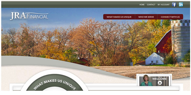
Start with JRA Financial in Maple Grove , MN, whose opening page scrolls through a variety of images: a nice group photo of the staff, a scenic picture of each of the four seasons in the local area, several navigation locations at the top, middle and bottom of the home page – including a "what makes us unique" button that leads to embedded videos explaining the client service experience and, separately, the investment process, plus a video that introduces the firm's team of employees.
"It has great design, RSVP features for events, and it's well laid-out," says Wisniowski.
J.F. Thompson Wealth Management in Littleton, CO also scrolls through various pictures, many of which appear to be stock photos, with a picture of Jeff Thompson, the company's managing partner and founder, looking friendly and accessible. There's a fairly standard menu bar at the top, and a "quick nav" area down below. The two largest navigation buttons are calls to action: "learn more" and "schedule your personal consultation today," which are located more accessibly in the middle of the home page. A "media" tab takes you to videos of Thompson explaining his views on how the financial services industry really works, and whether you would want to work with a retirement planner or financial advisor.
"Great use of a video blog format, and good calls to action," is Wisniowski's assessment.
DiNuzzo Index Advisors, Inc. in Pittsburgh pulls in a lot of content from a variety of sources, all listed under the "What's New" column on the right side of the website. The casual browser can take a risk-tolerance quiz, go through a retirement-analyzer calculator, check out company principal P.J. DiNuzzo's featured topics on his Sunday radio show, and find links to social-media pages in the upper-right-hand corner.
"These guys have a lot of fresh content from their radio show, TV segments and interviews, calculators etc., and they leverage the DFA website," says Wisniowski.
Millard & Company's website is branded by company founder Andy Millard's "low-stress investing" approach to asset management. Millard posts a weekly video and regular blog material – and the graphics at the top are recognizably quirky (or memorable) photos of Millard's Tryon, NC hometown.
"They have a great blog on their site, which generates a lot of traffic," says Wisniowski. "They also use the website for event registration, and there's good video content."
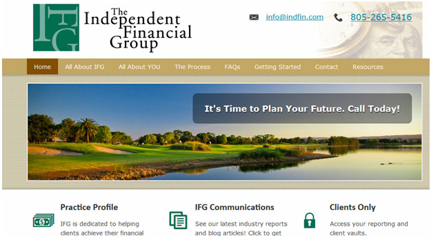
Click on the Independent Financial Group's website, and you see company founder Jim Lorenzen's tweets prominently displayed toward the bottom left of the page, and the bottom right invites prospects to subscribe to his company's newsletter. In addition to the fairly standard navigation bar at the top of the site, there's also a more prominent navigation bar that takes you to things that the company deems important: a link to client vaults, a link to a collection of industry reports and blogs, and a profile of the company itself.
"Good lead generation pieces throughout the site inviting you to download PDFs and book a phone appointment, plus good targeted content," is Wisniowski's appraisal.
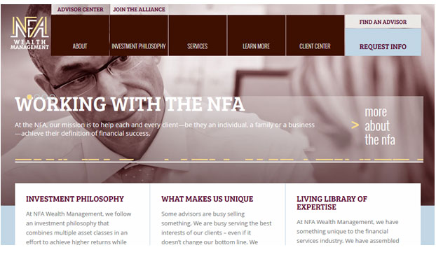
NFA Wealth Management scrolls among a variety of stock photos which look fresh and edgy because they are sepia-toned and very much in the background, behind a very bold navigation bar, and behind a bold invitation to learn how to work with the company, why clients are the firm's top priority, and links to content.
"Good usability and well-laid-out given the amount of content," says Wisniowski.
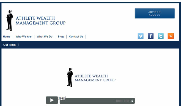
Athlete Wealth Management Group clearly focuses on a target market, and there's an introductory video at the very center of the website. Social media links are provided in the upper right-hand corner, and there are a lot of blog posts and Twitter updates along the bottom of the page.
"Cool example of a blog," is Wisniowski's comment.
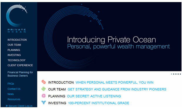
Finally, there's Private Ocean, whose home page scrolls between various pictures of company principals plus a group shot of the entire staff. Beyond that, the home page functions purely as a navigation hub, with a fairly standard navigation bar along the left side of the page, and a much larger and more inviting one down the middle, taking up two-thirds of the page.
"I've always liked this site," says Wisniowski. "Their mobile site is especially accessible; it makes calling, emailing and location easily accessible without scrolling down through a lot of pages."
As you read through this article, you realize that excellent web design, and state-of-the-art websites, are not nearly as difficult as most advisors imagine. But when you compare your website to the feature set that Wisniowski sees in the more advanced sites, you realize that sites created three to five years ago are falling dangerously behind the arms race to attract prospects, serve clients and give your firm a modern image.
The bad news is that you probably have to do an upgrade every year or two, and add new features as they become standard among the more forward-thinking firms in the profession. The good news is that today, adding a blog, coordinating your social-media efforts and creating video content is far easier than it was the last time you looked into updating your website.
Consider this a call to action: it's time to update your marketing presence on the web, and next year at this time, it will be time to do it again.
Bob Veres's Inside Information service is the best practice management, marketing, client service resource for financial services professionals. You can sign up for Inside Information ($299 a year) and a separate Client Articles service ($298 a year) which provides three or more Bob-written blog posts a month for your website or to send out to clients: www.bobveres.com.
Read more articles by Bob Veres