What Goes Up May Not Come Down, But it Has a Low Sharpe Ratio
Membership required
Membership is now required to use this feature. To learn more:
View Membership Benefits Advisor Perspectives welcomes guest contributions. The views presented here do not necessarily represent those of Advisor Perspectives.
It was a heck of a year for stocks. In 2023, tech led the way with a return of over 40%, leading to concerns about overvaluation in the sector. Nonetheless, past sector booms have been associated with volatile, but on average positive, future returns.
As I wrote recently, the drop in inflation and gentle slowdown in growth over the last few months provide a good backdrop for risk assets. So good, in fact, that the overall stock market and some sectors – like technology – are hovering near or at their all-time highs. The tech catalysts are well-known: excitement about AI, work-from-home trends, and strong profitability. The next chart shows the returns of U.S. stock market sectors over the last six years. The last 12-month (LTM) return is indicated in the legend, as well as the decile for the LTM return.
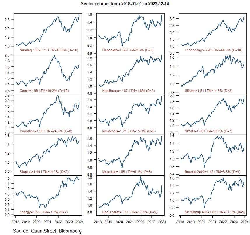
The deciles are calculated using sector-year observations in rolling monthly windows since 1990. A decile of 10 (D=10) means the LTM return for that sector has been higher than 90% of all sector-year observations (i.e., the return of one sector in one year) over the last 30+ years. A decile of 5 (D=5) means that the LTM return is higher than 40% of all sector-year return observations in the sample. The number to the right of the sector name shows the value of $1 invested in that sector at the start of 2018.
The three top-performing sectors in 2023 have been the Nasdaq 100, technology, and communications. Driven by the strong performance of large-cap tech names, all three are up 40% or more over the prior 12 months. Based on this LTM performance, the three indexes were in the 10th decile of the sector-year return distribution (i.e., better than 90% of all prior sector-year return observations).
But one may be concerned that after periods of such extreme performance, the future return outlook will be bleak.
Past booms
The mere fact that a sector of the stock market has had a high year-over-year return is not, in and of itself, a reason for pessimism. The next table shows the highest year-over-year sector-level returns, using data since 1990. The LTM Rets column shows the last 12-month sector return, and the NTM Rets column shows the return over the subsequent 12-month period. The date corresponds to the last month in the LTM Rets calculation. For example, for the 12-month period ending on January 31, 2022, the energy sector has a return of 75.7%. This was followed by a further 42.2% return over the subsequent 12 months.
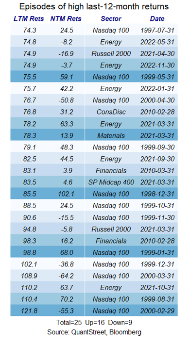
In fact, of the 25 highest sector-level annual returns since 1990, 16 have been followed by further gains over the next 12 months, and only nine have been followed by losses, though some of these losses were quite large. Also, many of the most negative sector-year return observations involve overlapping 12-month periods during the bursting of the dot-com bubble in late-1999 and early-2000, i.e., these were not independent events, but reflected one particular selloff episode. (For completeness, a list of the sector-year events with the 25 lowest LTM returns is shown at the bottom of the article.)
To gain more insight into market behavior following large sector-level rallies, I grouped LTM sector returns into decile bins based on past performance. The first decile contains the lowest LTM sector returns and the tenth decile contains the highest LTM sector returns. The upper left panel in the next figure shows the average LTM return in each bin. The average LTM return in decile bin 1 is -28% and the average LTM return in bin 10 is 49%. LTM returns are monotonically increasing across bins by construction.
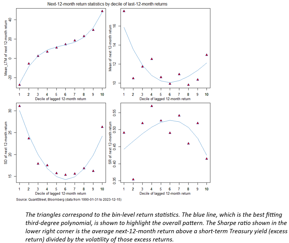
The upper right panel of the figure shows what happened in the next 12 months following an LTM return falling into each decile bin. Interestingly, for the worst past outcomes, the average next-12-month return was very positive, at 20%. This then fell to the 10%-12% range for the next eight bins, before rising to 13% for bin 10. That is, sector-year observations falling into the top decile of LTM returns were followed, on average, by a next-12-month return of +13%, which was higher than the outcome from all bins other than the first decile one.
What went up did not necessarily come back down.
But things were not all rosy. The bottom-left panel shows the volatility of the next 12 month return in each of the decile bins. The volatility of next-12-month returns shows a pronounced U-shaped pattern. The extreme bins, based on LTM returns, exhibit the highest volatility of next-12-month return outcomes. The first decile (the past busts) had the highest forward volatility of 31%, and the top decile (the past booms) had the second highest forward volatility of 26%. Bins 3-9 have much lower future volatilities, in the 15%-18% range (while bin 2 still has an elevated return volatility). The high average return in bins 1 and 10 is associated with much higher future volatility.
To assess the return to risk tradeoff in each LTM return bin, the bottom-right panel shows the Sharpe ratio of next-12-month returns. This is calculated as the average excess return – i.e., the return above a short-term Treasury yield – of each sector over the next 12 months, divided by the volatility of these excess returns. Except for bin 2 (likely a statistical fluke), Sharpe ratios exhibit a pronounced hump-shaped pattern. The highest Sharpe ratios occur for the middle-of-the-road bins, with not too-high returns and not too-high volatility. The busts bin (decile 1) has a relatively low Sharpe ratio of 0.49 and the booms bin (decile 10) has the 2nd lowest Sharpe ratio, at 0.41. The high average bin 1 and 10 next-12-month returns come with very high volatility, and that effect dominates, driving the extreme bin Sharpe ratios below the intermediate bin ones.
Range of outcomes
To better understand the distribution of future return outcomes from each LTM-return bin, the next chart shows a box and whisker plot of next-12-month returns from each decile bin. The horizontal line in each box represents the median next-12-month outcome from each decile bin. This has a similar shape to the mean return shown in the prior figure. The height of each box, i.e., the vertical distance from top to bottom, represents the half of all outcomes between the 25th percentile and the 75th percentile of next-12-month returns. The vertical lines extending from the top and bottom of each box have a length equal to 1.5 x the box height. And the dots at the top and bottom of each decile show the extreme outlier next-12-month returns emanating from each bin.
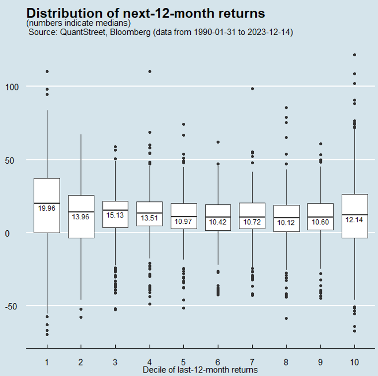
For example, for bin 1, the median next-12-month return is 19.96%. The 25th to 75th percentile outcomes range from 0% to around 40%. The most extreme positive next-12-month return is +110% and the most extreme negative return is -70%. For bin 10, these two extremes are +122% and -67% respectively. The box and whiskers plot reinforces the message of the Sharpe ratio analysis. The extreme bins have an extreme range of future possible outcomes, and the volatility engendered by these is so high that the Sharpe ratios of next-12-month returns of the extreme bins are lower than those of the middle bins, despite high average next-12-month returns.
Looking ahead
With the caveat that the past is no guarantee of the future, my analysis of extreme returns suggests that tech stocks are not necessarily due for a major correction just because they’ve had a big rally over the past year. In fact, the average return for sectors that experienced similar past booms was quite high. At the same time, the volatility of one-year forward returns for such boom sectors has also been high, with some extraordinarily positive outcomes, but also with some extreme negative returns.
At my firm, QuantStreet, we evaluate next-12-month returns for asset classes using two metrics: the output of our machine learning forecasting model and the last-12-month return trend. Based on the former (the machine learning model), tech stocks do not look that great. Based on the latter (the trend), tech stocks look extremely attractive. The blended signal of model and trend makes tech stocks look attractive. The present findings do not call into question this analysis, but they do suggest some caution around what the immediate future holds for tech: high average returns but with very high volatility and potential for extreme negative and positive moves.
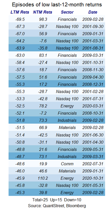
Past busts
For completeness, the table below shows the 25 largest year-over-year busts across different sectors.
Harry Mamaysky is a professor at Columbia Business School and a partner at QuantStreet Capital.
A message from Advisor Perspectives and VettaFi: The crypto landscape is on the brink of a revolution. Are you prepared for what's coming in 2024? Dive into expert insights on the future of crypto and its influence on next year's market. Join us at the Crypto Symposium on January 12th at 11am ET. Click here to register.
Membership required
Membership is now required to use this feature. To learn more:
View Membership BenefitsSponsored Content
Upcoming Virtual Events View All