An Example of a Great Website
Membership required
Membership is now required to use this feature. To learn more:
View Membership Benefits Advisor Perspectives welcomes guest contributions. The views presented here do not necessarily represent those of Advisor Perspectives.
Too many advisor websites are pathetic. Here is one that is not: MYRA Wealth.
There are five takeaways for advisors that will make your website truly great.
1. Clear, direct home page message
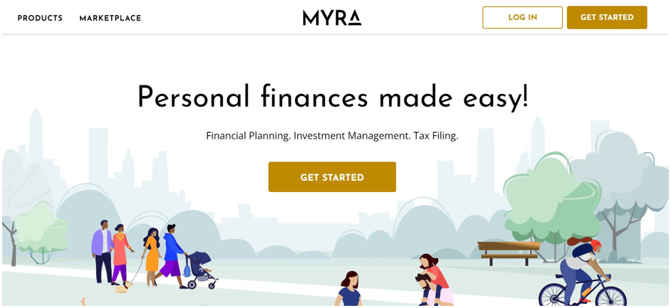
I like how MYRA’s home page has a lot of space and not a lot of text. Ah, I can breathe! It has a relaxing effect because I’m not hijacked by words everywhere!
But…
I’m not the biggest fan of the animation. But it sure beats the stock photo of the elderly couple sipping champagne on the yacht.
2. Pithy copywriting
Notice something very specific about how the copy is written. I like how there is a big, bold headline and then a sub-header.
- The bold headline: Finances made easy
- The sub-header: Financial planning, investment management. Tax filing.
Here’s why the home page copywriting is so powerful:
- The use of periods chops up the sub-header line and emphasizes a few key services instead of droning on and on.
- There are at most four words on either the header or sub-header lines.
- The claim that things are made easier rings true because it’s so effortless to absorb this message right away. I’m sick of advisors who claim they made retirement or wealth management easy but reading their website is like reading a legal briefing.
- Lots of white, open space at the top of the page helps me to breathe and relax.
- And best of all, there’s no blabbing, unnecessary adjectives (“life goals,” “comprehensive financial plan”) or vapid emotional statements.
3. Menu-like presentation of services and fees
How come advisors claim to make finances so clear and simple, and then when someone asks you what you charge, suddenly you turn into a Congressional spokesperson?
Here’s a simplifying idea: Put your fees on your website and lay it out like a menu in a restaurant, as done on MYRA’s products page .
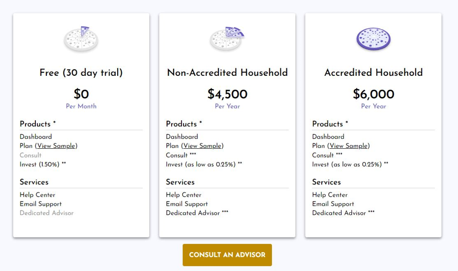
I like how they offer a sample financial plan (which you have to input your email to download, by the way, which helps MYRA build its mailing list). Instead of trying to offer up some esoteric, technical definition of financial planning that nobody besides other financial advisors understand, they make it clear through example.
Bravo!
4. Designed for relevance
MYRA’s site allows for a more personal viewing experience. The information presented is more relevant because of the choices it gives the reader.
See the radio button in between “Individual” and “Household?” on MYRA”s products page ?
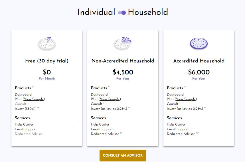
Yes, they really are making it easy. You don’t have to sift through tons of irrelevant information to find what applies to you – they make it more relevant by giving you the button to click.
5. Psychological profiling included in client descriptions
Instead of vaguely saying something like, “We work with pre-retirees, retirees, and wealthy business owners” it presents detailed, clear examples of actual people they work with.
You can click and read Sundar’s full story. They have three other sample client stories: Manny, Penelope and Javier, and Elon and Grimes.
What I like about these stories is that they fully describe the client’s background in depth, and their level of knowledge prior to coming to seek help. It makes them real. This helps the reader identify with the type of person who elects to do business with MYRA.
Here’s what most of you fail to understand.
The doubts don’t arise over your level of competency. Most of the time, people have filtered out the advisor who don’t have the credentials or experience on paper.
It’s not about you.
It’s about them.
What people are looking for is the feeling that you have worked with similar people to them:
- Do you have experience working with people who think like me?
- What if I’m not smart or knowledgeable enough to understand the terms you use, or the concepts you discuss?
- Do you work with people who have gone through things like I have or am about to go through?
- Do you know how to handle someone with a personality like mine, meaning all the quirks and challenges that my personality may present?
It’s better than just spewing out statistics about how many clients you have, how big their portfolios are, etc. Every advisor’s practice looks the same.
Make it personal and present a real-life psychological profile of the type of person who typically meshes well with you.
Sara’s upshot
Thanks for hanging out with me.
I write no-nonsense blogs, website copy and other financial advisor marketing copy for anyone who is tired of the gibberish. If you want to work with me on a project, contact me.
Subscribe to Sara’s Daily and receive one actionable marketing tip a day, just like the ones I presented in this blog. Sign up here.
A message from Advisor Perspectives and VettaFi: Advisors: You're Invited to Exchange! Nothing would be a better start to the new year than if you joined us at Exchange, an in-person conference for members of the financial services community in Miami, Florida on February 11-14th. For a limited time, we're offering you a free Exchange ticket!* Register today with code WINTER24 to claim your pass.
Membership required
Membership is now required to use this feature. To learn more:
View Membership BenefitsSponsored Content
Upcoming Virtual Events View All