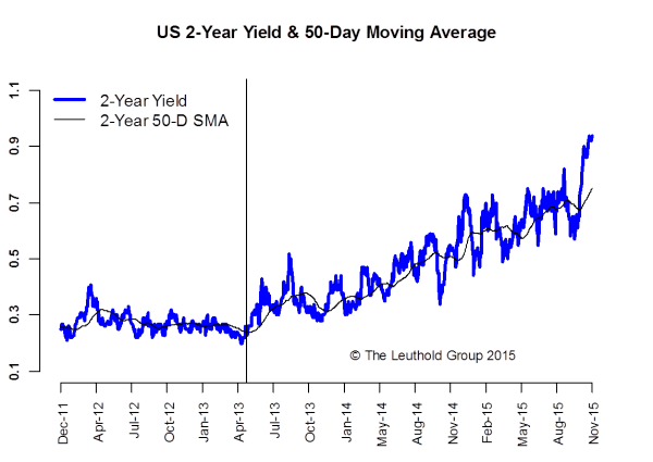
A lot has happened since our last report. A December rate hike has become the consensus. The 2-year Treasury yield, a good proxy for market expectations of an imminent rate hike, finally broke through the 75 bps ceiling (horizontal line on Chart 1) and surged to around 95 bps. Note how Bernanke’s “Taper Talk” in May 2013 started the two-year yield’s upward trend. Not only has the yield been trending up, it has also been getting more volatile as we get closer to the hike.
The first few days of December were full of fireworks too. The ECB became the Grinch who stole Christmas when it badly disappointed investors with a much less aggressive easing program. The market reaction was violent as the Euro-funded carry trades got unwound. As a result, the ECB managed to cut rates and trigger the biggest tightening in Euro zone financial conditions in the last two years, as both the Euro and bond yields surged. So much for more easing!
U.S. data has been decent overall with the strong November jobs report offsetting the weaker ISM figures (both Manufacturing and Services). With little top-tier data in the way, the Fed looks set to hike at its December meeting. The sharp dollar pull-back after the ECB decision also makes it easier for the Fed to pull the trigger. At this point, the worst outcome for the risk markets would be no hike in December.
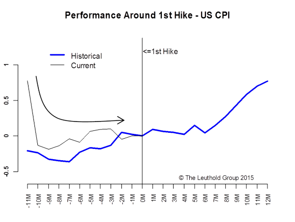
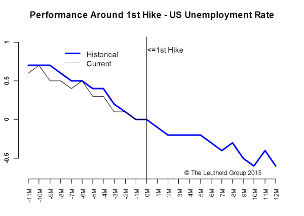
Indeed, the job market offers the strongest support for a rate hike. Chart 2 shows the historical pattern of the U.S. unemployment rate around the first rate hike.* The current downtrend in the unemployment rate fits the pattern very well. However, the same thing can’t be said about inflation, one of the bigger macro-economic differences between now and previous hikes. CPI has fallen sharply in the last year or so while, according to the historical pattern, it should be trending up (Chart 3). The only comfort we find here is that it has not gotten worse in recent months. The renewed sell-off in oil prices will not help either.
*The first hikes in 1977, 1987, 1994, 1999, and 2004.
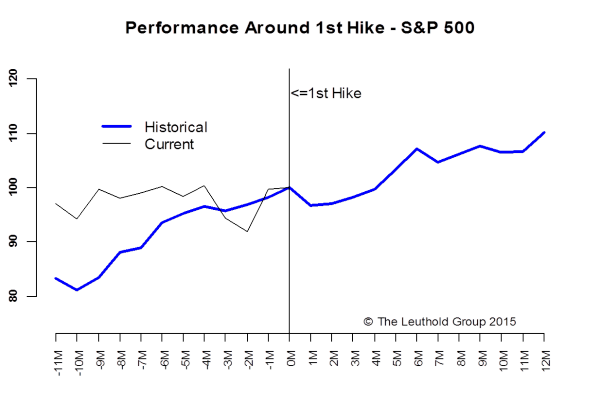
When it comes to asset market performance, we found more differences than similarities. The S&P 500 has been in a directionless range over the last year while a clear uptrend is typically observed around the first hike (Chart 4).
So why is current market behavior different? We believe uncertainties surrounding the inflation outlook has a lot to do with it. As we showed on Chart 3, inflation typically gains enough strength for the Fed to start a tightening cycle, but this time it is trekking so close to the flat line that it makes the Fed’s job much more complicated. As a result, the market couldn’t get any clarity on Fed policy direction until recently. This explains the volatile YTD range bound action.
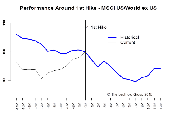
When the Fed starts its rate hike, it typically pays to look outside the U.S. for better relative performance. Chart 5 shows a clear outperformance of international stocks in the 12 months prior and 6-months after the first hike. This was only true for the first few months of 2015 and U.S. stocks have since reclaimed the lead.
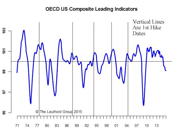
We think the timing of the rate hike can explain a large part of the difference here. This rate hike is much later than the previous first hikes. On average, the first hike happens about three years after the business cycle trough (we use the OECD U.S. Composite Leading Indicators), while this time it is six years after the trough (Chart 6). More importantly, all previous hikes occurred when the CLI index was well into positive (expansionary) territory, while this time it is in negative (contractionary) territory! The U.S. market is typically a better performer in the contractionary phase.
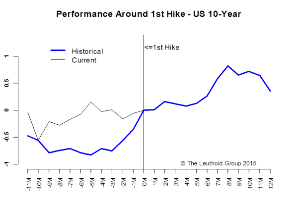
Historical interest rate patterns seem to fit the expansionary mid-cycle macro context that typically prevails when the Fed starts a new tightening cycle. Interest rates typically rise moderately in the 12 months around the rate hike; nothing dramatic (Chart 7). So far this year the U.S. 10-year yield has also been trapped in a directionless range, which is quite different from the historical pattern. Again we attribute this to the uncertainties surrounding the inflation outlook and Fed policy. After the rate hike, we expect the upside in yields to be limited by the global disinflationary backdrop. In other words, unless inflation, especially wage inflation, starts to gain serious traction here in the U.S., we would not expect a material increase in interest rates.
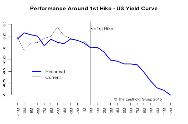
The yield curve, on the other hand, is likely to flatten going forward, tracking the historical pattern (Chart 8). This should not come as a surprise since a tightening move is expected to suppress inflation expectations, which will cap or even push down the long end of the curve. Note that movements in the yield curve earlier this year have also been quite different from the historical pattern, but it has tracked much more closely the last couple of months as the rate hike picture has become more clear.
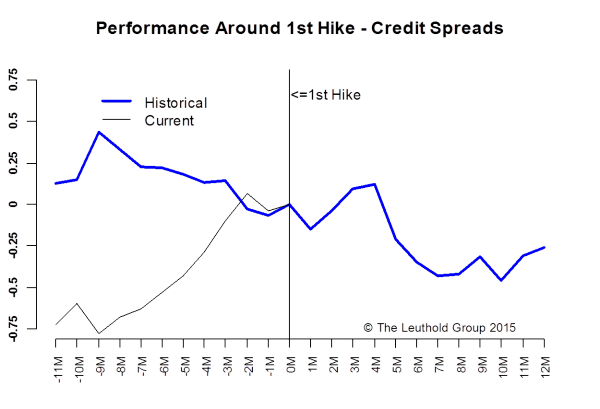
Credits have borne the brunt of the Fed hike anxiety and a volatile oil market certainly did not help. The big widening move in credit spreads this year is in stark contrast to the historical narrowing trend around the first rate hike (Chart 9). This is another great example of how different this rate hike is. In other words, we are not seeing the more favorable higher rates, narrower spreads pattern. Instead, the Fed is risking hiking rates when credits are already showing signs of stress. This is probably why the market expects the Fed to be very gradual in hiking rates. So a “dovish hike” it has to be.
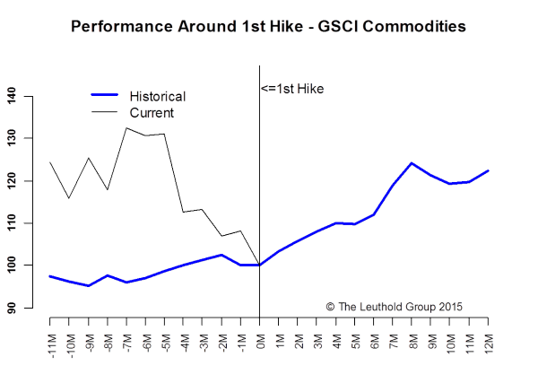
Historically, commodities perform well around first rate hikes as inflation is typically increasing. This time, commodity performance could not be more different (Chart 10). The carnage in commodities is not limited to oil as weaker global demand and a stronger dollar put tremendous pressure on all commodities. Disinflation, as we know, is a self-reinforcing power and lower prices beget even lower prices.
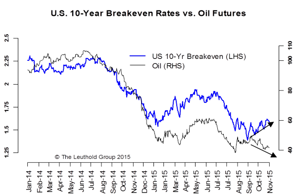
There is, however, a tiny glimmer of hope. The recent down-leg in oil prices has not yet been accompanied by a similar drop in the 10-year breakeven rate (Chart 11). This is a positive divergence, as far as inflation is concerned. We are hopeful that this divergence will result in oil prices converging to the upside rather than inflation expectations converging to the downside. It’s certainly too early to say but definitely worth monitoring.
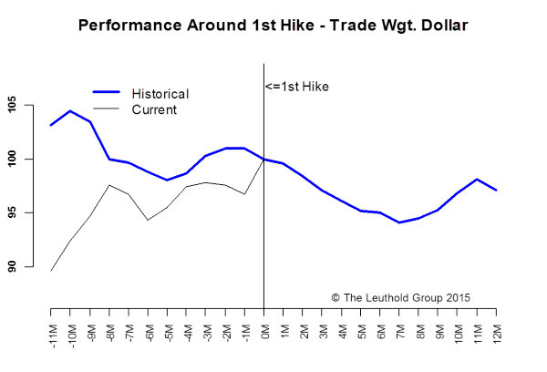
Another key determinant of inflation going forward is the direction of the U.S. dollar. Historically, the dollar only saw a rally in the six months leading up to the first rate hike and it usually weakened after the rate hike (Chart 12). This time it’s also very different as the dollar has pre-empted the Fed’s move by rallying close to 20% in the past year or so. With the December rate hike pretty much priced in, a weaker dollar should not surprise anybody at this point. If the dollar does indeed weaken, it will be a much needed tailwind for all inflation-sensitive assets.
So the bottom line is: this rate hike might really be different as it occurs in an environment where, despite strong job growth, the business cycle has already turned contractionary, disinflation is still dominant, and various risky assets are showing late-stage characteristics. In other words, we are in unchartered territory. Expect the unexpected.
© Leuthold Weeden Capital Management