The S&P 500 is down only 4.1% from its all-time high on September 2, an improvement from the 5.9% decline at the October 4 low. Is this modest decline the beginning of the major bear market we have been warning is likely in the coming months or the years, or it is just another buying opportunity in the 12 year old (and counting) bull market?
Unfortunately, no one knows the answer to that, since 100% certainty is not possible in investing. The best we can do is look at key technical indicators to try to assess probabilities.
From a technical (i.e., chart) standpoint, bull and bear markets are a process. Technical indicators move sequentially as prices move. The first signal a bear market is starting, as happened in early 2008, is when the price of a major stock index such as the S&P 500 falls below a long-term moving average such as the 250-day moving average (250-dma). Currently, the S&P 500 would have to fall over 7% to drop below its 250-dma.
Next, a shorter-term moving average, such as the 20-dma, falls below the 250-dma. Then a medium-term moving average, such as the 60-dma, falls below the 250-dma. Usually around that time, the 250-dma line will change from sloping upward or flattish to sloping downward. These sequential changes are typical indicators of a bear market starting.
Many other technical indicators we monitor, including breadth indicators, provide additional evidence that a bear market is likely starting.
Ignoring these technical signals can be very costly for investors. Waiting until stocks are down 20-30%+ to determine if a bear market is starting, as most investors do, can be a very expensive mistake!
So let’s look at what some of these key technicals indicators are telling us right now.
Daily And Weekly S&P 500 Charts
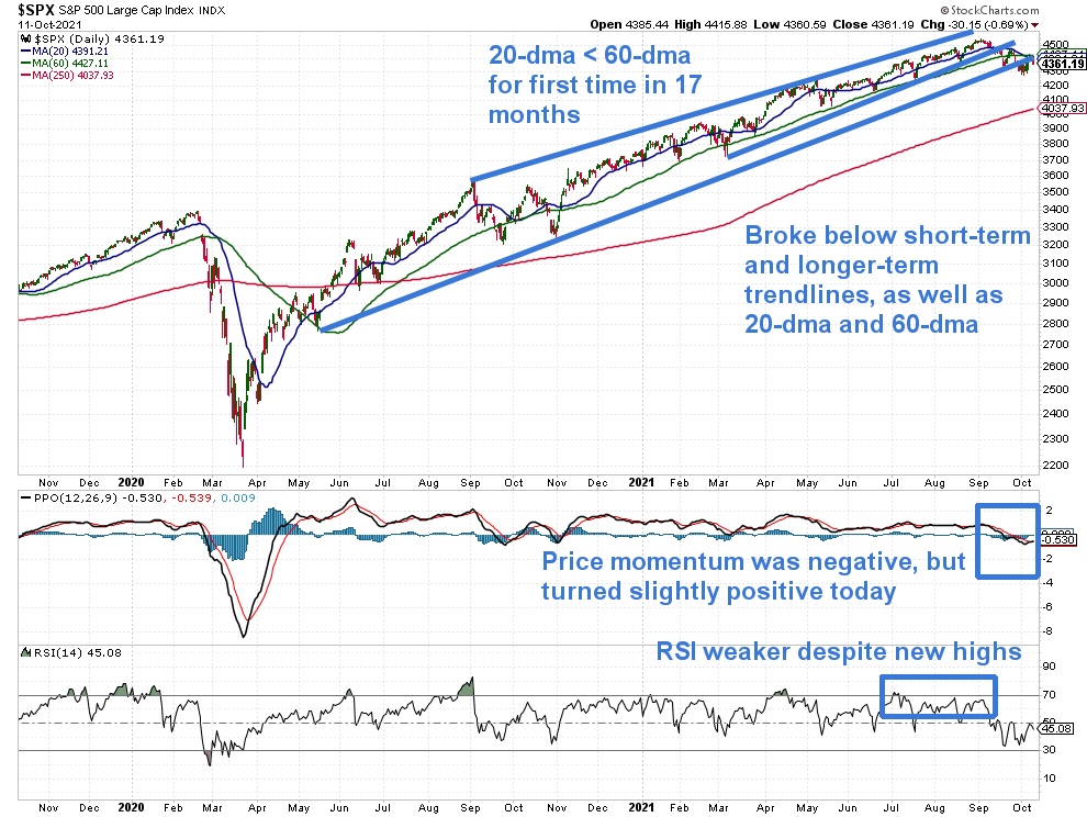
First, let’s look at the daily price chart of the S&P 500 (top main clip), along with the Percentage Price Oscillator (PPO, second clip) and Relative Strength Index (RSI, third clip). This is always the first and most important chart to focus on.

We see four important takeaways from this S&P 500 chart:
- the 20-dma has fallen below the 60-dma for the first time in 17 months; that means the short-term trend is down for the first time since the Covid panic bottom in March 2020, which may be significant
- prices have fallen below the short-term and long-term trend lines we have drawn on the chart, as well as the below 20-dma and 60-dma
- price momentum, based on the PPO, had been negative, but just turned slightly positive today
- RSI has not made new highs since April, which is a bearish non-confirmation of the new highs the S&P has made since then
Overall, these are concerning signals that require watching closely.
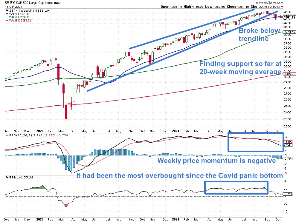
Now let’s look at the weekly price chart of the S&P 500 below.
We see four key takeaways from this chart:
- prices fell below the trend line we have drawn on the chart that has been in place for the past 17 months
- prices are holding around the 20-week moving average so far
- price momentum, based on the PPO, has been negative since June and has become more so in the past month
- RSI shows the S&P 500 was overbought until this recent selloff
These are also concerning signs, particularly the weak price momentum.
Breadth Indicators
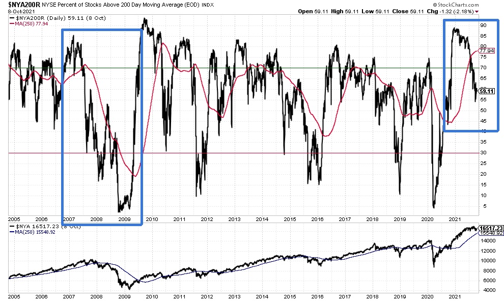
Now let’s look at some key breadth indicators, which help us see what is going on below the surface of the major price indices. A healthy stock bull market is one where most stocks are in bullish uptrends (positive breadth), while a stock bear market is one where most stocks are in bearish downtrends (negative breadth).
The chart below shows the percentage of NYSE stocks that are trading above their 200-dma, which is a popular technical definition of being in a bull market uptrend. This percentage was at 89% in December 2020 and has now fallen to 59%. That is still a long way from the 30% level that typically signals a bear market (as happened in early 2008), but that is a lot of technical damage considering the S&P 500 is only 4.1% below its all-time highs.
The next chart shows the percentage of NASDAQ stocks that are trading above their 200-dma. This percentage was at 82% in February and has now fallen to only 35%. That means nearly two-thirds of NASDAQ stocks are technically in bear market downtrends. This indicator is very close to the 30% level indicative of bear markets.
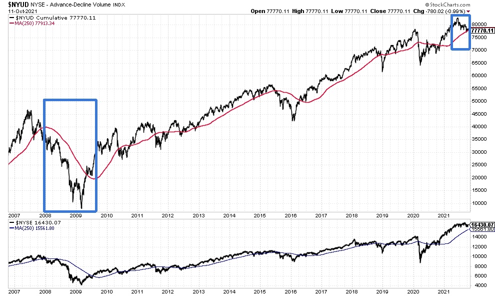
Another useful breadth indicator is NYSE Advance-Decline Volume. As shown on the chart below, NYSE Advance-Decline Volume fell 0.2% below its 250-dma today. A decisive break below the 250-dma followed by the 250-dma slope turning downward, as happened in early 2008, would be a key indication that a bear market is likely starting.
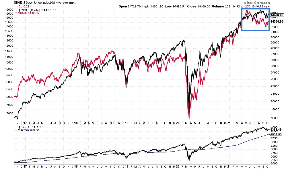
Next, let’s look at “Dow Theory” signals, which were developed by Charles Dow a century ago. A key tenet of Dow Theory is that the stock market is considered to be in a bull market when both the Dow Jones Industrial Average (DJIA) and Dow Jones Transportation Average (DJTA) are in bull market uptrends together, which means both averages are achieving higher highs and higher lows in prices.
Conversely, the stock market is considered to be in a bear market when both the DJIA and DJTA are in bear market downtrends together, which means both averages are reaching lower highs and lower lows in prices. A possible change in trend is signaled when the two averages are out of sync in terms of trend.
The DJTA peaked on May 10 and has fallen nearly 10% since then, with lower highs and lower lows. So far, the DJIA is only down 3.2% from its all-time high on August 16. If the DJIA were to fall another 3.5%, it would be a new lower low, as it would break below the important June 18 low of 33,271.93. That would confirm a Dow Theory sell signal (and also break below a “head and shoulders” neckline formation). The DJIA’s 250-dma is 5.4% lower than current prices.
Lastly, we note that the S&P 500 Industrials Sector has underperformed the S&P 500 Consumer Staples Sector since early June, which shows that stock investors have become more concerned about economic growth. The relative strength line of Industrials versus Consumer Staples is just above its 250-dma.
Implications For Investors
These technical indicators tell us that the stock market remains in a bull market, but if it were to fall about 4-8% from here, that would likely trip enough bearish technical signals to tell us that the stock market is likely entering a new bear market.
How deep that bear market might be requires analyzing additional technical, economic and valuation indicators, as we did in our Investing Insights article “Here’s Why The Next Stock Bear Market Will Likely Be The Worst Since The Great Depression”.
How to profit, instead of lose money, from that bear market is discussed in our interactive Member Q&A “How can you make money — instead of lose money — in a major bear market with ETFs?” and Investing Insights article “How To Trade ETFs To Maximize Bear Market Profits”.
As always, we will keep you updated as new signals emerge to help us assess changes in market trends.
© BullAndBearProfits.com
Read more commentaries by BullAndBearProfits.com