It’s time for our annual August report called “Charts for the beach.” Take a look at five of our favorite charts that highlight what we think consensus is currently missing. Remember to wear your official RBA baseball cap while sitting in the sun!
An example of why you should ignore politics.
We have repeatedly pointed out that politics is about what should be, but investing is about what is. Listening to politicians for investment advice has rarely been worthwhile.
A recent example is the significant outperformance of the South Korean stock market. Our first chart shows that the performance of the South Korean stock market has year-to-date roughly tripled the performance of the US market, and is up more than 30% in USD terms. Importantly, that outperformance comes despite the geopolitical risks posed by North Korea. Politicians have focused on North Korea, but it’s been beneficial for investors to focus on South Korea’s improving fundamentals.
CHART 1:
MSCI Korea Index vs. MSCI USA index
Year-to-date thru 7/31/17

Source: Bloomberg Finance L.P. For Index descriptors, see “Index Descriptions” at end of document.
Investors are warming to risk, but certainly aren’t risk takers
RBA’s three main investment factors are profits, liquidity, and sentiment, and we follow a host of proprietary sentiment indicators to gauge whether investors are too scared or too willing to take risk. Our indicators almost uniformly show that investors are warming to risk, but have yet to become true risk takers.
Our second chart shows the relative valuation of high beta and low beta stocks in the US. One can see that investors have been very risk averse during this cycle, but that aversion is beginning to subside. The valuation of higher beta stocks has risen, but higher beta stocks are still selling at a discount to the broader market. It has generally been a cautious signal when high beta stocks sell at premium valuations.
CHART 2:
Forward Relative P/E by S&P 500®
High & Low Beta Quintiles
as of 7/31/17
Source: Richard Bernstein Advisors LLC, BofAML US Quantitative Strategy
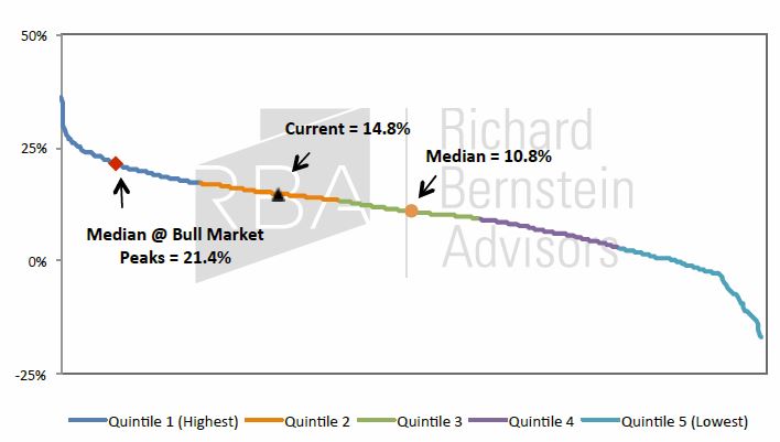
US stock market returns don’t look extreme relative to history
Not only are investors still risk averse, but stock market returns are not as extreme as some might suggest. Our third chart contrasts the current five-year return of the S&P 500® with the historical distribution of five-year returns. Of course, the recent experience is above the median because there is a bull market. However, one should immediately recognize that the last five years’ return falls far short of the typical end-of-cycle, “blow off” rally.
The last five years’ return of 14.8% is well short of the median return of 21.4% that occurred in the five years leading up to the peak of bull markets.
CHART 3:
Distribution of S&P 500® Rolling 5-Year
Annualized Total Returns (Dec. 1930−Jul. 2017)
Source: Richard Bernstein Advisors LLC, Bloomberg Finance L.P. Standard & Poor’s
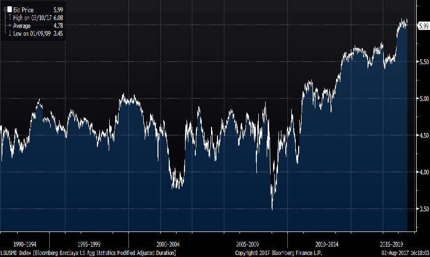
Riskiest bond market ever?
Five years ago the investing consensus was that central banks’ money printing would result in massive inflation soon. Accordingly, investors shunned duration risk. However, the inflation so many investors feared never arrived, and consensus shifted to “lower for longer.” The over-subscribed 100-year bond issued by a country that has historically defaulted about once per decade shows that fixed-income investors now have an insatiable appetite for yield and duration risk.
The huge demand for yield and duration comes at a time when the duration risk of the bond market is the greatest ever. Our fourth chart shows the duration of the Bloomberg Barclay’s US Aggregate Bond index. Whereas duration has historically ranged between 4 and 5 years, it is now a bit more than 6 years which is the highest ever in the history of the index. The rush for income has come exactly when the bond market is the riskiest in history!
CHART 4:
Bloomberg Barclays US Aggregate Bond Index:
Modified Adjusted Duration (12/31/89−7/31/17)
Source: Bloomberg Finance L.P. For Index descriptors, see "Index Descriptions" at end of document
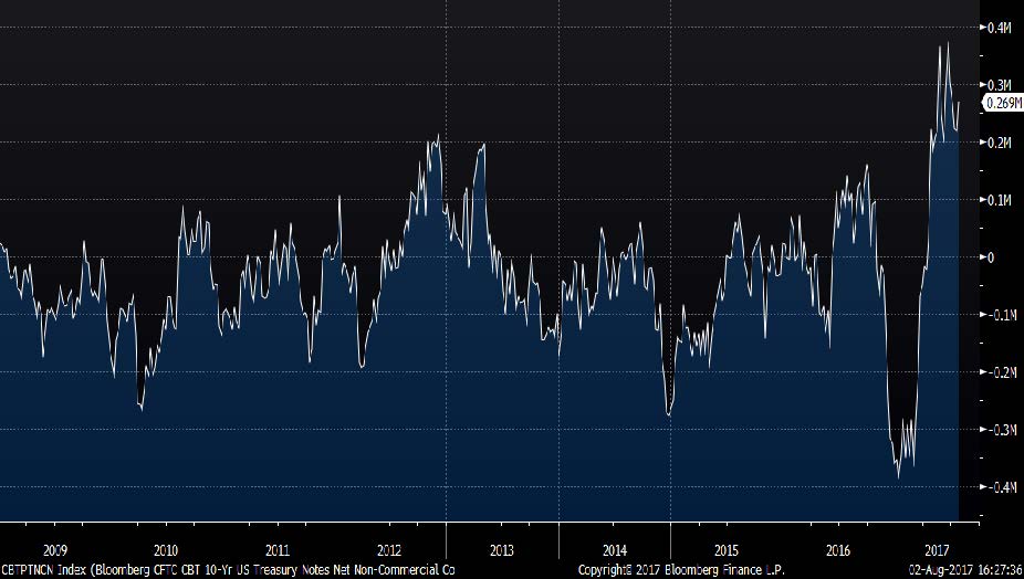
If one doubts that there is an insatiable demand for duration risk, consider our last chart. It shows hedge funds’ net long position in long-term Treasury note futures and options. As a group, hedge funds are the most bullish on Treasuries that they’ve ever been during this cycle, and are aggressively betting that interest rates will fall.
Combining charts 4 and 5 suggests it might be the bottom of the 9th inning for the bond market.
CHART 5:
Hedge Fund Positioning: Bloomberg CFTC CBT 10-Yr US
Treasury Notes Net Non-Commercial
Combined Positions (12/31/08−7/31/17)
Source: Bloomberg Finance L.P. For Index descriptors, see "Index Descriptions" at end of document.
INDEX DESCRIPTIONS:
The following descriptions, while believed to be accurate, are in some cases abbreviated versions of more detailed or comprehensive definitions available from the sponsors or originators of the respective indices. Anyone interested in such further details is free to consult each such sponsor’s or originator’s website.
The past performance of an index is not a guarantee of future results.
Each index reflects an unmanaged universe of securities without any deduction for advisory fees or other expenses that would reduce actual returns, as well as the reinvestment of all income and dividends. An actual investment in the securities included in the index would require an investor to incur transaction costs, which would lower the performance results. Indices are not actively managed and investors cannot invest directly in the indices.
US: MSCI US. The MSCI US is a free-float-adjusted, market-capitalization-weighted index designed to measure the equity-market performance of the United States.
South Korea: MSCI Emerging Markets Korea Index. The MSCI EM Korea Index is a free-float-adjusted, market- capitalization-weighted index designed to measure the equity-market performance of South Korea.
Bloomberg Barclays US Agg: Bloomberg Barclays US Aggregate Bond Index. The Bloomberg Barclays US Aggregate Bond Index is a broad-based flagship benchmark that measures the investment grade, US dollar-denominated, fixed-rate taxable bond market. The index includes Treasuries, government-related and corporate securities, MBS (agency fixed-rate and hybrid ARM pass-throughs), ABS and CMBS (agency and non-agency).
Hedge Fund Positioning: Bloomberg CFTC CBT 10-Yr US Treasury Notes Net Non-Commercial Combined Positions.
The Commitments of Traders (COT) reports provide a breakdown of each Tuesday's open interest for markets in which 20 or more traders hold positions equal to or above the reporting levels established by the CFTC. A trader must report his or her position if at the daily market close, their position is at or above the CFTC's reporting level in any futures month or option expiration. A trader is determined to be commercial or non-commercial using the following rational: All traders' reported futures positions in a commodity are classified as commercial if the trader uses futures contracts in that particular commodity for hedging as defined in the CFTC's regulations (1.3(z).
© Richard Bernstein Advisors LLC. All rights reserved. PAST PERFORMANCE IS NO GUARANTEE OF FUTURE RESULTS
Nothing contained herein constitutes tax, legal, insurance or investment advice, or the recommendation of or an offer to sell, or the solicitation of an offer to buy or invest in any investment product, vehicle, service or instrument. Such an offer or solicitation may only be made by delivery to a prospective investor of formal offering materials, including subscription or account documents or forms, which include detailed discussions of the terms of the respective product, vehicle, service or instrument, including the principal risk factors that might impact such a purchase or investment, and which should be reviewed carefully by any such investor before making the decision to invest. Links to appearances and articles by Richard Bernstein, whether in the press, on television or otherwise, are provided for informational purposes only and in no way should be considered a recommendation of any particular investment product, vehicle, service or instrument or the rendering of investment advice, which must always be evaluated by a prospective investor in consultation with his or her own financial adviser and in light of his or her own circumstances, including the investor’s investment horizon, appetite for risk, and ability to withstand a potential loss of some or all of an investment’s value. Investing is subject to market risks. Investors acknowledge and accept the potential loss of some or all of an investment’s value. Past performance is, of course, no guarantee of future results. Views represented are subject to change at the sole discretion of Richard Bernstein Advisors LLC. Richard Bernstein Advisors LLC does not undertake to advise you of any changes in the views expressed herein.
© Richard Bernstein Advisors
Read more commentaries by Richard Bernstein Advisors