Omissions of the Omen: "Hindenburg Omen" and the Selloff Last Week
Key Points
- Rising US Treasury bond yields and Fed "taper talk" … not to mention a "Hindenburg Omen" sighting … hit stocks last week.
- A look inside the Omen should calm fears of impending doom.
- The market is likely not out of the woods, but we don't expect an overly sinister correction.
Most of our writing lately has still been optimistic in the longer term, but cautious in the near term. We don't try to time stock-market pullbacks with any kind of precision, but given very elevated investor sentiment—a contrarian indicator—and flashes of overbought conditions technically, we've recently been in the short-term pullback camp. Whether the May 31 swoon into the market close was the beginning of a pullback is yet to be determined. However, the chatter about why it occurred is worth delving into.
Yes, US Treasury bond yields have been moving up sharply, and that's caused some volatility in stocks…in keeping with "taper talk" from the Federal Reserve as the market begins to discount the eventual interest-rate-normalization process (which I'll get to later). But the more-interesting chatter was about the sighting of the ominous-sounding "Hindenburg Omen"—a bearish technical indicator—on Friday.
First, an Omen primer
As per Zero Hedge and Bespoke Investment Group (BIG), there are five criteria that need to be satisfied in order for the Hindenburg Omen to be triggered:
- The daily number of New York Stock Exchange new 52-week highs and the daily number of new 52-week new lows must both be greater than 2.2% of total NYSE issues traded that day.
- The smaller of these numbers is greater than or equal to 69 (68.772 is 2.2% of 3,126). This is not a rule, but more like a checksum. This condition is a function of the 2.2% of the total issues.
- The NYSE 10-week moving average is rising.
- The McClellan Oscillator1 is negative on that same day.
- The new 52-week highs cannot be more than twice the new 52-week lows (however, it's fine for new 52-week lows to be more than double new 52-week highs). This condition is absolutely mandatory.
This bearish technical indicator last triggered on August 20, 2010. The market did sell off for the next four trading days—though to the tune of only 2.3%—before a huge 30% rally over the subsequent eight months. So it's not always a successful warning. Indeed, while the Omen has appeared before every major market decline since 1987, market declines have followed only 25% of the time following Omens. Keep that in mind.
Ostensibly, the rationale behind the new highs / new lows part of the indicator is that when a large percentage of stocks are simultaneously hitting new highs and lows, it's an indicator of turmoil and confusion in the market, which can lead to panic and lower prices.
But as BIG pointed out, a closer look at the "stocks" that made new lows on the NYSE shows that they aren't actually stocks! A third of the securities that made new lows on May 31 had the word "income" in them and a third had the word "municipal" in them as well. Nearly all of the new NYSE "stocks" making new lows were a mixture of closed-end fixed income securities, preferred stocks, or some other form of fixed income product listed on the NYSE.
BIG looked at the new 52-week highs and lows on the S&P 500® Index (which includes only stocks), and here we saw 6.2% of its stocks made new 52-week highs, while zero made new 52-week lows.
Back to the real story
The more likely culprit to the market's recent weakness: the back-up in bond yields in keeping with "taper talk" by the Fed as it looks to eventually begin scaling back its Treasury and mortgage-backed securities purchases associated with its quantitative-easing programs.
If the Fed begins to taper its purchases in keeping with an improving economy, we believe the market should ultimately behave quite well. There has been some weakness in economic momentum recently, though the weakness has largely been among inflation readings. Lower inflation is a good thing in the current environment. But the June 3 report from the Institute for Supply Management Manufacturing Index was disappointing. On the other hand, strength has been notable among housing and consumer confidence/sentiment readings.
If this is the beginning of a prolonged period of rising interest rates, what could that mean about prospects for the stock market? Birinyi Associates analyzed nine periods since 1962 when the yield on the 10-year Treasury significantly increased over a sustained period of time. The beginning of those cycles does not necessarily signal a peak in stocks.
Significant periods of rising rates

Source: Birinyi Associates, Inc., as of May 31, 2013.
In fact, the S&P 500 increased a median 0.8% three months later, a median 11.3% six months later and a median 13.8% a year later. As far as sectors go, cyclicals were the top performers, with technology, industrials and materials leading the gains for the three-, six- and 12-month periods.
None of the above prevents a pullback from occurring. But the reality is that a correction of sorts has been well underway for several weeks … a correction that's more about rotation among sectors than about overall stock-market declines.
In the charts below, you can see that the classically defensive (typically higher-dividend-yielding) sectors, which often do well when bond yields are falling, were the stars of the market this year—until the end of April. But in May, as you can see in the second table, the more cyclically oriented sectors shined, while the defensives underwent a correction.
"Sell in May" was only about defensive sectors
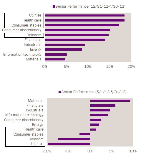
Source: Bloomberg, as of May 31, 2013.
For those who weren't aware, two weeks ago we upgraded our recommendation on industrials, which joined technology as the "outperform"-rated sectors. We also moved consumer discretionary up to "marketperform." Finally, we downgraded our recommendations on both the utilities and consumer-staples sectors and they're now rated "underperform."
The net is that we don't think the market is out of the woods in the near term, but we also believe any correction is likely to be less sinister than those that occurred during the past three years.
1. The McClellan Oscillator is a widely followed breadth indicator developed by Sherm McClellan and is calculated using the difference between the number of advancing and declining issues on the NYSE.
Important Disclosures
The S&P 500® Index is a market-capitalization weighted index that consists of 500 widely traded stocks chosen for market size, liquidity and industry group representation.
Indexes are unmanaged, do not incur fees or expenses, and cannot be invested in directly.
The information provided here is for general informational purposes only and should not be considered an individualized recommendation or personalized investment advice. The investment strategies mentioned here may not be suitable for everyone. Each investor needs to review an investment strategy for his or her own particular situation before making any investment decision.
All expressions of opinion are subject to change without notice in reaction to shifting market conditions. Data contained herein from third party providers is obtained from what are considered reliable sources. However, its accuracy, completeness or reliability cannot be guaranteed.
Examples provided are for illustrative purposes only and not intended to be reflective of results you can expect to achieve.
© Charles Schwab